
A lot of things go into making a website. It may just look like a bunch of words and images plopped together to make something cohesive and ‘pretty’, but it’s more than that. Your website is part of your brand; its a tool for marketing your business, and most of all, it’s an ambassador for your business.
By detailing how I design websites, hopefully, I can give you a better idea of what the process looks like and give you some ideas on how to design your own.
Key Terms
Marketing is full of fancy words. If you’re not familiar with the terminology, it can easily get confusing. Before we jump into the details of creating a website, let me define some key terms that I’ll use throughout this article.
Brand
Your brand is how the world sees or considers your company; a feeling or set of perceptions that your business evokes in people. When it’s done right, a brand perfectly combines of design, language, and experiences to nurture the right emotions towards your business. Basically, it comes down to your identity as a company. Who are you as a business, and how do you want people to think of you?
Logo
A logo is a visual embodiment of your business which speaks to what your business does and what it stands for. Typically, it’s the first element that will shape the rest of your brand.
Brand Elements
Elements are the bells and whistles that add the “wow factor” to your brand. Brand elements could include visuals (colours, images, typography, etc.), specific words or phrases, identity, personality, positioning, image, communication, and differentiating factors.

Now that we’re all clear on the lingo, we can now move to the nuts and bolts of this process. As a graphic designer, I’ll be focusing on the design aspect.
Designing a website
Many confuse their website with their brand, but that’s not the case. A website is only one of many aspects of your overall brand. Having said that, your brand should be very clear from your website; a user should have a solid understanding of who you are, what you do, and what’s important to you after a few minutes on your site. Effective branding on a well-designed website shows credibility and trustworthiness, which leads to an increase in revenue.
Ideally, your business will already have a basic brand before you start designing a website, including some basic elements like a logo, colours, typography, and maybe even some imagery. If you don’t have anything but a logo, you can use that as your starting point, and build your brand out from there, taking inspiration from other places.
I look for my inspiration from the colours used in the logo, the business’ indoor decor scheme, and the fonts used in their logo.
This will be so much easier to understand with examples
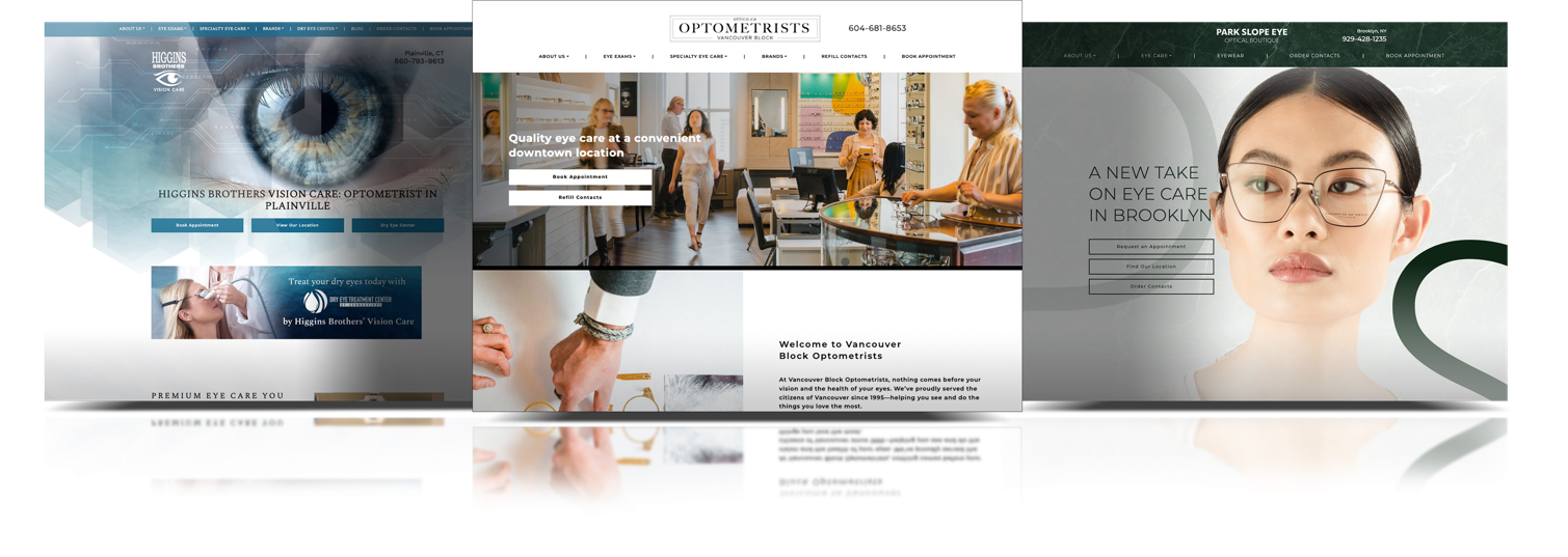
Case Study: Willoughby Optometry
Willoughby Optometry came to us with an amazing logo. It was very clean and modern with pre-established colours and typography. The client was very happy with their logo and now wanted us to create the rest of their branding, including a website.
Along with their logo, they also provided photos of their practice’s interior. From speaking with them, I understood their personal style and their general taste, along with their expectations for their brand. They wanted something very light and airy with a lot of white space and earthy neutral tones. Most of all, they wanted that elusive “wow” factor.
Their interior design definitely spoke to their brand identity, likes, and dislikes. So now the challenge was to take all of that and convert it to a website that was consistent with the branding elements they’d already established, like their logo and their interior design.
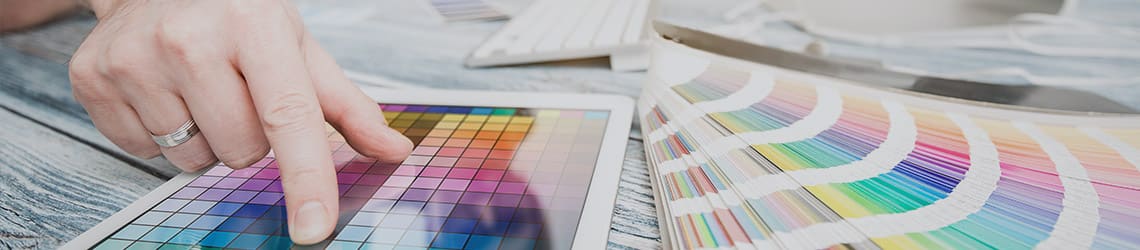
Choosing Colours
Colours are everything. They can dictate the energy and emotions you want a web user to feel without using words. Colours can contribute up to 80% in brand recognition, so choosing the right colours is essential to your brand.
There are two categories of colour – brand colours and neutral colours. Brand colours are specific to your brand, like red and gold for McDonald’s. Neutral colours are what you’ll use for body copy and backgrounds and things like that.
Neutral colours include black, white, grey, brown and beige. These help other colours to stand out better and tone them down at the same time to prevent your website from being overpowering.
Typography
Typography is the second element of brand recognition. Picking the right fonts can be a daunting task, but here are some quick tips to select fonts that will best suit your brand.
- Pick a font that will complement or look good next to the logo.
- Legibility is everything. Choosing a font that’s easy to read will help keep your reader digest the content without getting frustrated or distracted.
- Sans-serif fonts are usually more modern and contemporary, whereas serif fonts are usually used to add traditional touches. Both serif and sans-serif fonts can be used in combination or on their own. Ideally, you’ll use sans-serif fonts for the web, as studies show they’re easier to read.
- Play with different weights of the font.
Textures
Textures are the third element of brand consistency. They’re mostly used to complement the logo instead of overpowering it.
I take inspiration from a business’ interior to create brand consistency. When the user visits the website and decides to come to your business in person, they’ll probably notice (either consciously or subconsciously) the similarities in the colours and textures used on the website and your business interiors.
All these elements together they make an amazing brand!