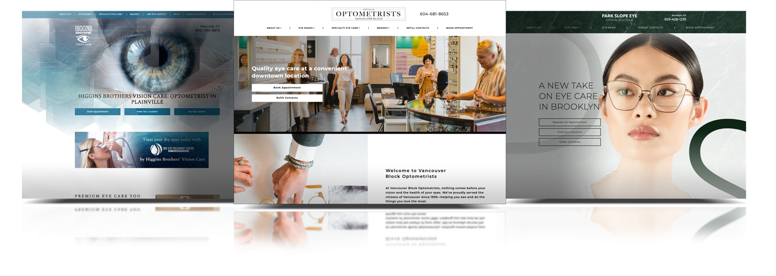
The essential components your website needs to stay relevant for 2020.
It is important to view your website as a dynamic marketing tool. Technology changes quickly and your website can begin to feel out of touch over time. New features and styles are unveiled all the time, and the digital world moves FAST…very FAST.
The frequency for redesigning your website should ultimately be based on your online goals. After some time your website may no longer be reaching your business’s maximum potential and that’s a problem. To keep your online presence modern we recommend revamping your website every 2 years. We like to think of your website as your best sales employee and if they are not performing as well as they should it’s time for some TLC.
The Features You Need for the Future
As a team, we design A LOT of eye care websites. We have the experience to highlight what is really important in your eye care website to get you maximum pay off. Now you can sit back relax and rest assured that we have your bases covered.
Speed
I’m sure you are not surprised by this one. Everyone has been trying to increase the speed of their website for years. However, it has become increasingly more important with every passing year. The data shows that 93% of people have left because a website didn’t load quickly enough. People have EXTREMELY high expectations for loading times. You can easily lose your audience in under 5 seconds.
Companies who have streamlined their website to load as fast as possible will have a higher conversion rate (percentage of people who take a desired action). This is because a website that loads faster will have a better user experience (UX). It doesn’t matter how beautiful or how many cool features you have on your website, data-heavy sites need extra time to load. People will abandon their search before your site has loaded properly if your content is slowing it down.
If that’s not enough, Google now prioritizes the fastest loading websites in its ranking. Meaning you will appear higher on more searches just by optimizing your website for speed. The higher you rank the more organic traffic you will get on your website.
If you’re not sure if your website is running fast enough it’s probably time for a website audit (psssst… did we mention we do that for free?).

Streamlined Design
Minimalist does not mean boring! Not only are minimalist websites a popular aesthetic for 2020, but it is the best design to ensure your patients can find what they are looking for. Streamlined web design creates a clear navigational path for your users and minimizes any frustration.
Designing a streamlined website involves reducing the number of distracting elements that slow down site performance and replacing them with clear and useful content. Plus by freeing some space it allows navigation to become more intuitive for your patients. A streamlined design displays the difference between a good-looking site and one designed with purpose.
Once you have reduced the clutter, ensure that you feature simple and engaging visuals to capture attention and guide the user throughout the website. We also recommend that you replace a bright color scheme with two or three brand colors that match perfectly and compliment your brand.
And voila! You are on your way to improved user experience and faster load time.

Mobile-First Vs Mobile-Friendly
The percentage of people using their phones to surf the web has been steadily increasing for years. According to Template Monster, the percentage of visitors that use their mobile devices to surf the internet increased from 57% to 63% last year.
With over half of your patients using mobile to view your website it is time to prioritize how your site functions on mobile devices. Especially since the data shows that 93% of people will quickly abandon their web search if your website does not display properly on their device.
Designing Mobile-first means having the mobile users experience at the forefront at all stages of the design, not as just an afterthought. Improving the mobile version of your website will not just make it look pretty on a smartphone. It will actually get you more views. Since 2016, Google created the mobile-first index which ranks a website based on their mobile version instead of their desktop version. How you rank on Google should always be high up on your priority list. In 2020, the requirements to get ranked will only get stricter so you need to make sure your mobile version is up to speed.
Conclusion
There you have it, the top 3 features your eye care website must have going into 2020. However, this is just the tip of the iceberg when it comes to web design. If you have any concerns about your website’s performance feel free to make use of our free website audit. Or you can talk to one of our highly qualified web designers who specialize in designing websites specifically for eye care professionals.


