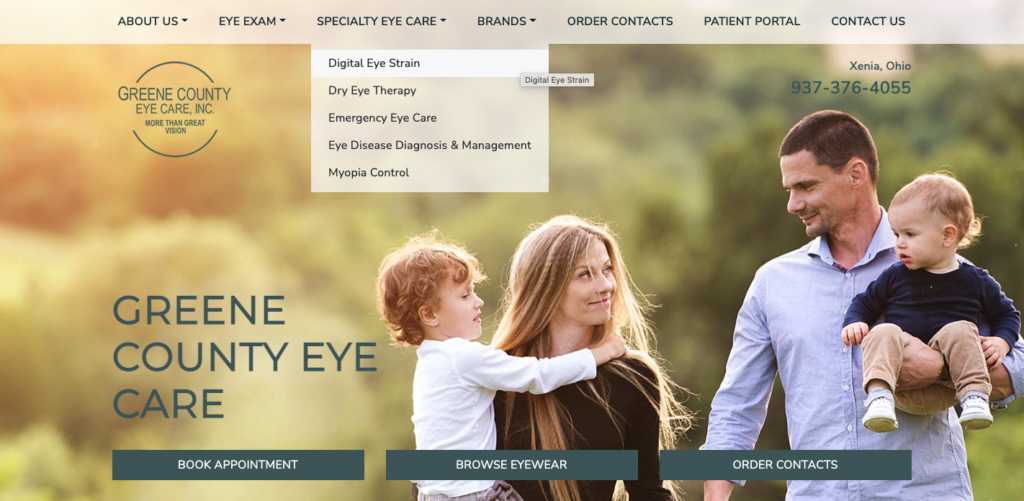
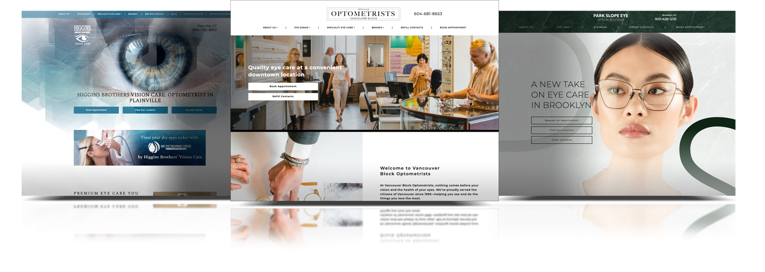
Your optometrist website is the first place many people will go to learn about your services. It’s important to ensure that your website is up-to-date and provides visitors with all the information they need. Here are some tips for making your optometrist website better:
1. Add more information about the services you offer. This could include a list of the different types of glasses you offer or information about the procedures you perform.
2. Upload images and videos of your work. This will help potential patients better understand what to expect when they come to see you.
3. Highlight the team of optometrists who work at your practice. This will give patients a sense of who they will be working with and builds trust in your practice.
4. Offer patients a way to book appointments online. This makes it easy for them to schedule an appointment at their convenience and cuts down on wait times.
5. Ensure your website is mobile-friendly. If your website is not mobile responsive potential patients are leaving your site.
Add Service Pages to Your Website

When potential patients visit your website, they will want to learn about your services. This is where your service pages come in. These pages should outline the different services you offer, as well as the procedures you perform. This information can help potential patients decide if they want to come and see you.
When it comes to optimizing your optometrist website for search engines, one of the most important things you can do is create individual service pages for each service. These pages are dedicated to providing information about the specific services that you offer, and they can help boost your SEO rankings.
In addition to including lots of valuable information, it’s also important to ensure your service pages look great. Use high-quality images and videos to showcase your work, and make sure the formatting is easy to read. By taking these steps, you can create an informative and visually appealing service page that will help improve your website’s SEO rankings.
High-Quality Images and Videos
Adding high-quality images and videos to your optometrist website can help make it more user-friendly and informative. Images can help patients understand your services, while videos can give them a better idea of what to expect during their appointment. Make sure to choose images and videos that are high-quality and relevant to your practice. This will help ensure that your website provides a positive experience for visitors.
Introduce your Team
When patients visit your optometrist website, they should be able to learn about the team of optometrists who work at your practice. This can help build trust and credibility, and it can also make patients feel more comfortable working with you. You can highlight the backgrounds and qualifications of each optometrist on your team and provide patients with photos or bios. Patients will appreciate knowing who they will be working with, and this information can help encourage them to book appointments. Things to include:
1. Introduce the team of optometrists and office staff who work at your practice
2. Include an image of each team member
3. Describe the education and experience of each team member
4. Highlight any specialties that your team of optometrists may have
Book Online

Optometrists rely on word-of-mouth to build their businesses. This is, in part, because people generally only go to the optometrist once a year for a checkup. However, there are ways that optometrists can improve their online presence and make it easier for patients to book appointments.
One way to do this is to add a booking system to your website. This will allow patients to select a convenient time and book an appointment without having to call or visit your practice in person. This can be especially helpful for people who live far away from your office or have busy schedules.
It’s important to add call-to-action buttons on the website that encourage patients to book an appointment. Adding these call-to-action buttons to your website is a great way to increase the number of appointments you book online. And, since they are easy to create and install, there is no reason not to add them to your website.
Mobile-Friendly
A mobile-friendly website is essential for any business these days. Over 50% of website traffic comes from mobile devices. If your website isn’t optimized for mobile users, you’re likely losing out on a lot of potential business.
There are several things you can do to make your website more mobile-friendly. The most important is to ensure that the layout of your pages is easy to navigate on a small screen. You should also use a responsive design, which will adapt the layout of your pages to fit the device being used. Additionally, you can use plugins or software to make your website faster on mobile devices. If you’re unsure if your website is mobile-friendly, several online tools can help you test it. One such tool is Google’s Mobile-Friendly Test. This tool will analyze your website and let you know any areas that need improvement.

To stay competitive in today’s market, it’s essential to have a mobile-friendly website. By following the tips mentioned above, you can easily make your website more accessible for mobile users and improve your Bottom Line!
Next Steps
In this article, we have outlined five ways that you can make your website better. These include adding detailed service pages, using high-quality images and videos, introducing your team of optometrists, adding an online booking option, and making your website mobile-friendly. By following these tips, you can ensure that your website provides a positive experience for visitors and helps you book more appointments.
If you’re unsure about how your website stacks up to other optometrist sites in your area, book a free website audit with our team!


