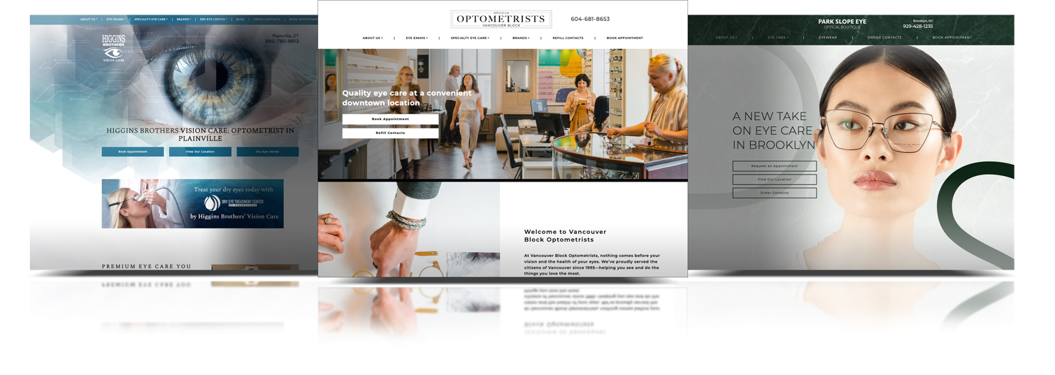
Your website is often the very first “hello” a potential patient gets from your practice. You want it to be welcoming, helpful, and a true reflection of the excellent care your team provides. So, how do you make sure your online space is more than just a digital business card? That’s a question Marketing4ECPs helps eye care professionals answer every day.
A high-performing website is built on three key pillars—great design, clear content, and strong technical performance. When these three elements work together, your site becomes a powerful tool that helps your practice grow, showcasing the benefits of working with specialists who understand the eye care industry.
What Is a High-Performance Website?
A high-performing website does more than just look good. It acts as the digital front door for your practice, helps turn curious visitors into new patients, and serves the people you already care for. Think of it as your hardest-working team member—it’s always on, ready to help, and makes a fantastic first impression. It’s a cornerstone of effective digital marketing for optometrists.
Key 1: Impress with Great Design & Usability
Your website’s design is the first thing a visitor notices. A clean, professional, and easy-to-use site shows people you care about their experience, even before they step through your door.
Reflect Your Practice’s Brand
Your site should feel like a natural extension of your practice. Use colours, logos, and photos of your actual team to represent the welcoming atmosphere you’ve created. This simple step helps build instant recognition and trust, which is the foundation of a strong practice brand.
Make Navigation Simple for Patients
Visitors should find what they need in just a few clicks—not a frustrating scavenger hunt. A logical layout with clear menus helps people book appointments, find your location, or learn about your services without any hassle.
Create a Mobile-Friendly View
Many of your patients find you on their phones while they’re on the go. Your website needs to look and work just as well on a small screen as it does on a desktop computer. A mobile-optimized experience is a must for any modern eye care practice.

Key 2: Connect with Clear Content & Structure
The words and information on your site guide patients and tell the story of your practice. Great content, organized in a thoughtful way, answers questions and encourages people to book their next visit with confidence.
Write for Your Ideal Patient
Use simple, clear language that speaks directly to your patients and their needs. Effective writing for the digital age means you can leave the complex jargon for your industry conferences. Focus on how your services can help them see and feel their best. This patient-first approach makes your digital marketing for optometrists much more effective.
Organize for a Smooth Experience
Structure your site in a way that just makes sense, following best practices for onsite SEO and website structure. Group similar services together and make sure your contact information and appointment booking options are easy to find on every single page. A smooth online journey often leads to a booked appointment.
Answer Common Questions Upfront
Think about the questions your front desk team answers all day long. Your website can handle many of them, freeing up your team for more hands-on tasks. You can create pages or sections that cover:
- Services you offer
- Insurance information
- Frames and lenses you carry
- What to expect during a visit

Key 3: Boost with Performance & Speed
What happens behind the scenes is just as important as what patients see on the screen. A fast, secure, and technically sound website keeps visitors happy and helps your practice show up in search results.
Why a Fast Website Matters
People are busy—if your website takes too long to load, they may give up and look elsewhere. In fact, around 53% of mobile website visits are abandoned if they take longer than 3 seconds to load. A quick-loading site provides a better experience for your visitors and is also favoured by search engines like Google.
Secure Your Patient’s Trust
Your website must be secure, especially if you have online forms that handle patient information. An SSL certificate—which gives you the “https” and a little padlock icon in the web address—protects data and shows visitors your site is safe to use, which is critical for maintaining HIPAA and PIPEDA compliance.
Put the 3 Keys to Work for Your Practice
When you combine great design, clear content, and strong technical performance, your website becomes a powerful asset. It helps you attract the right patients, provides them with a great experience, and supports the growth of your practice through smart digital marketing for optometrists. Building a site that checks all these boxes is what the team at Marketing4ECPs can help you achieve. To see how these principles can be applied to your practice, you can schedule a discovery call.


