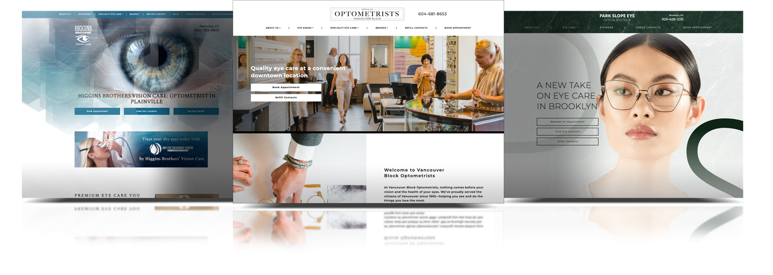
There are many important factors to keep in mind when creating a custom website. Elements such as conversion rate, speed, and mobile optimization (just to name a few) have the power to make or break your optometry website.
One factor often overlooked, but equally as important as the function of your website is the design. The overall look and feel play a huge role in representing your brand and converting your website visitors into new long-lasting patients. The design of your website can also convey the overall look and feel of your practice location before your patients visit you in person.
We interviewed our designers to learn about their favourite Marketing4ECPs websites, how they bring our client’s visions to life and about the process and hard work that goes into creating functional and stunning website designs.
Peyman | Senior Graphic Designer
What’s Your Favourite Website and Why?
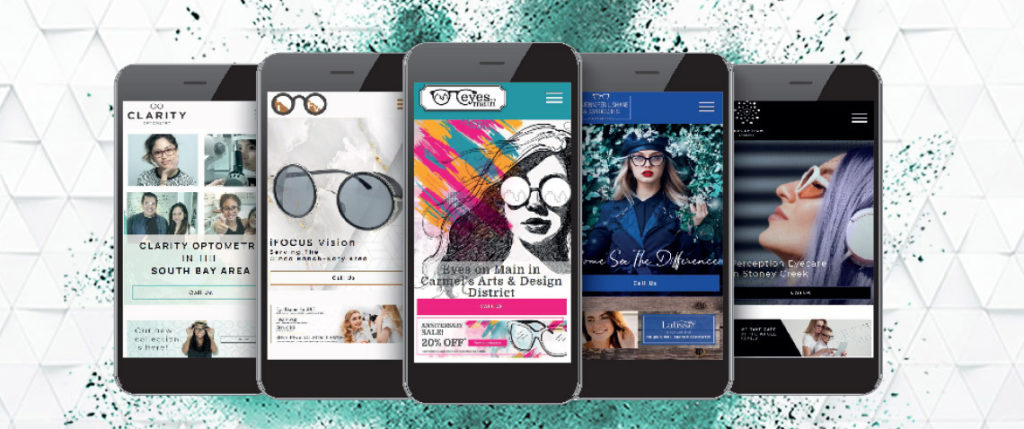
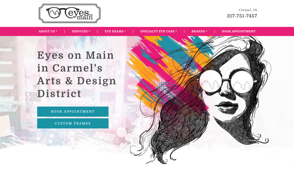
My favourite website I have designed is Eyes on Main in Carmel, and their twin website, Eyes on Chagrin. These websites truly challenged me to push the levels of my website design capabilities. I like them both for the striking colours, abstract patterns, and the bright experience the websites bring out.
What was the Clients’ Vision, and How did You Bring it to Life?
The clients’ vision was to create a bright, extraordinary website that genuinely pushed the design limits. They wanted something that was out of this world and captured the personable nature of their brands.
As someone who excels when working with bright, abstract and flashy design concepts, I was extremely excited to get started and help this client bring their vision to life.
Ultimately, I made sure that I knew exactly what the client wanted while also researching and combining my own design experience in this particular niche to create something truly remarkable.
How did you Design the Website?
Designing these two sites was challenging but brought about streamline methods as they were both twin sites. I understood the vision and wanted to ensure that we captured that bright design that pushed the boundaries.
Overall, we achieved exactly what they wanted and they were extremely excited with how we captured their brand through this fantastic website design.
Kehna | Graphic Designer
What’s Your Favourite Website and Why?
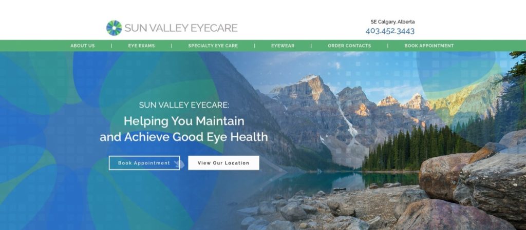
My favourite website I have designed has been for Sun Valley Eyecare. I love it because of how vibrant the colours stand out and paired with the imagery, I think there is a really great flow to the site.
What was the Clients’ Vision, and How did You Bring it to Life?
The clients’ logo branding was essential and important to them. Their practice has several accent walls with their bright green and blue colours, so naturally, they wanted their website to reflect this – which was great because as soon as I saw the colours, my mind was spinning with design ideas! The client was also looking for a modern, sleek yet clinical and professional without feeling too sterile.
A typical concern clients have when using blue colours is that they will lose the warm, welcoming feeling, so I brought that back by using imagery of happy, smiling individuals. I also treated all the photos to have the same filter on them (again subtle and relatively unnoticeable), which ended up creating this feeling of continuity throughout the rest of the site.
How did You Design the Website?
Given their vibrant brand colours, I added subtle textures so the colours would stand out. Using the iris from their logo, we created a really fun “pixelated” square pattern and gradients, emphasizing their branding colours and taking it to a new level.
The content team also ensured all the written copy came across friendly and highlighted the customizable experience at Sun Valley Eyecare, which ties together the whole page to provide a very inviting feeling.
We’re still working on bringing it to life by representing their primary brand colours while adding subtle textures and filters to brighten the imagery.
Tracy | Senior Graphic Designer
What’s Your Favourite Website and Why?
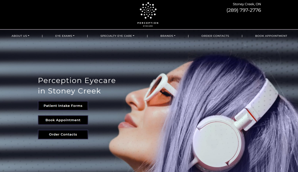
Perception Eyecare has been my favourite website to design so far. I was inspired by their logo and created a website that complemented their branding as well as the interior of their practice.
I love this website because it showcases the brand in the colours, elements, and images used. We really blended their colour palette well with the physical aspects of the practice look and feel, which we translate to the overall design of the website.
What was the Clients’ Vision, and How did You Bring it to Life?
The client wanted to represent their practice as trendy, modern, and different. Being a young doctor, this was important to reflect that on the website through the visual elements. The core demographic for this practice is ‘trendy moms,’ so we needed to create a trendy and unique design.
How did You Design the Website?
Pulling from the unique logo, I translated the colours and dots into unique textures that are used throughout the website. I also illustrated the trendy vision of the client through the exceptional, eye-catching hero image. I used professional photography to further personalize the look and feel of the website.
The client was very happy with the trendy design we achieved and felt this website reflected the uniqueness found in her practice.
Sonia | Graphic Designer
What’s Your Favourite Website and Why?
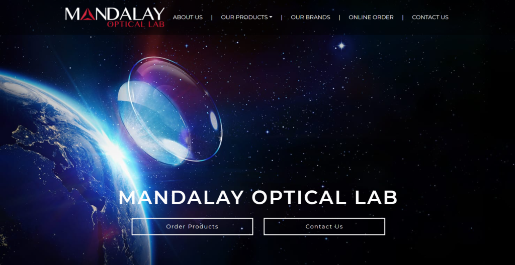
My favourite website is one of our recent website designs, Mandalay Optical Lab, a business that produces made-to-order high-quality optical lenses for independent and private practices. I love this website because it is edgy, technologically driven, professional, and, most importantly, captivating. The colours and imagery speak loudly and are complimentary to the dark aesthetic of the site.
What was the Clients’ Vision, and How did You Bring it to Life?
While the client came to us with vaguely established branding, and we wanted to expand on this aspect of the business and the logo. The client was looking for something edgy and professional while maintaining a wonder for the optical world.
How did You Design the Website?
Keeping the client’s vision in mind, I got creative with the elements of sleek and dark aesthetic by creating a very unique and eye-popping hero image. I also kept the idea of technology at the forefront of my mind when creating the layout and overall page designs.
The client was thrilled with how this website turned out and how we were able to further develop the branding of the practice through the various design elements we implemented in this website.
Kate | Graphic Designer
What’s Your Favourite Website and Why?
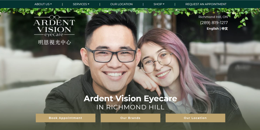
My favourite website design is Ardent Vision Eyecare. I love this site because it was unique compared to other websites we had recently launched. We used a lot of unique elements throughout this website that the team had not seen before. The reason why this is my favourite site is because of how excited the client was. That’s what’s most important to me: a happy client!
What was the Clients’ Vision, and How did You Bring it to Life?
With this website, the client wanted a warm and earthy-toned feel to make the visitors feel at home while also complimenting the new interior of the practice – something quirky, whimsical, and unique. I used dark, warm brown wood with many plants to compliment the colours and images from interior photos and design plans.
How did You Design the Website?
I wanted to add small details from the practice throughout the website so that the site and interior were unique but had subtle connections. For every section, I created a symbol that was similar to their logo. It was a small detail that the client loved. I wanted to use images of art they had on the walls to bring life to the pages.
For example, the client had wallpaper in the practice that looked like a cat wearing glasses, but the lenses were mirrors. I thought this was so unique I found a place for it on their website for everyone to see. The client loved it.

Many elements come into play when designing websites for our amazing clients. Our website designers have many years of experience designing optometry-eyecare-specific websites, understand all essential aspects involved, and can bring our client’s visions to life.
If you’re looking for a new, custom, high-converting website for your practice, book a demo with us! We’re happy to discuss how we can design something unique for your practice.