Websites are a unique platform that combine both visual and textual elements in ways that other mediums don’t. Adding imagery to your website is a great way to break up text into more manageable pieces, and are sometimes the most effective way to get your message across.
Remember, the average web-user doesn’t necessarily want to scroll through pages and pages of copy. Images, particularly icons are an eye-catching way to keep the user’s attention.
Common Usage of Icons
Icons are a very effective way to get your message across to your customers without having to resort to long sections of text. In addition to using them on websites they can also be incorporated into print documents such as reports, proposals, and presentations.
They are also an effective way to showcase, at a glance, the services your company offers and what their values are. Icons are an incredibly versatile medium, and there are many ways you can incorporate them into your company’s website and documents.
Creating Visually Striking Icons
Sometimes the icon you need already exists. Commonly used ones such as a magnifying glass or car are available from any number of reliable sources. However, have you ever stopped and wondered where those icons come from and who creates them?
Creating a set of matching icons that conform to your exact specifications and needs is a highly rewarding task. A well thought out and carefully produced icon is an effective and visually striking way to convey your message in an instant.
In this blog post I will take you through the steps required to produce a simple, yet effective set of icons. The method I will show you can act as a guide, but feel free to change and customize it as you see fit. Ultimately you have complete control over your creative domain.
Step 1: Brainstorming
Brainstorming icon ideas can be done using a pen and paper or on the computer, whichever method works best for you. Jot down the values or services that you want to develop icons for. In this example we will be creating icons for the following set of core values:
- Education
- Nutrition
- Development
- Communication
When you think of these four words what sort of images spring to mind? Your answers do not have to be literal (such as a depiction of an apple to signify healthy food as a subset of nutrition) but they should relate to the value or service you are developing the icons for.
For example, let’s look at education. The results of your brainstorming session may look something like this:
Education
- Gold medal
- Podium
- Light bulb
- Open doors
- Sun and clouds
- Rainbows
- Shooting star
- Open book
What words stand out most to you when you think of education? You can develop your icon based on a single word or combine words to create a visual story. I tend to visualize best in my head, but you can also draw out various ideas using a pen and paper if that helps you to jumpstart your creativity.
Based on this brainstorming section I have decided to combine the concepts of an open book with a shooting star. To convey my message I have decided I want to depict an open book with a shooting star coming out of the pages.
Step 2: Preparing Your Work Canvas
Now that you have decided what concepts you want to be represented in your icon it is time to start designing it. One best practice to follow while designing graphics is to ensure that they are vector based. Vector based graphics can be resized as necessary and will not pixelate, ensuring that your icon always looks smooth and polished.
Some examples of vector graphics include AI, EPS, and SVG. All of these types of graphics can be developed in the Illustrator program by Adobe. In this example we will be creating our icons as 2D line art, so we will not be going into 3D graphics in this article.
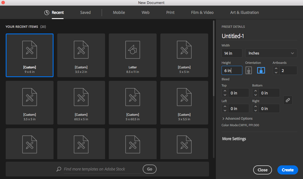
You can choose whatever sized canvas works best for your needs. In this example we will be using a 14 inch by 6 inch canvas with no bleed.
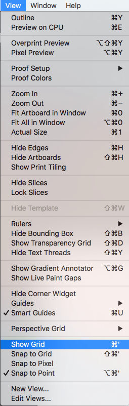
Before you begin the graphical development aspects of your icon you should make sure that you have set your grid in Illustrator. To do this go to View, then Show Grid as shown below:
Once you have turned on your grid in Adobe Illustrator your canvas should look similar to the one shown below:
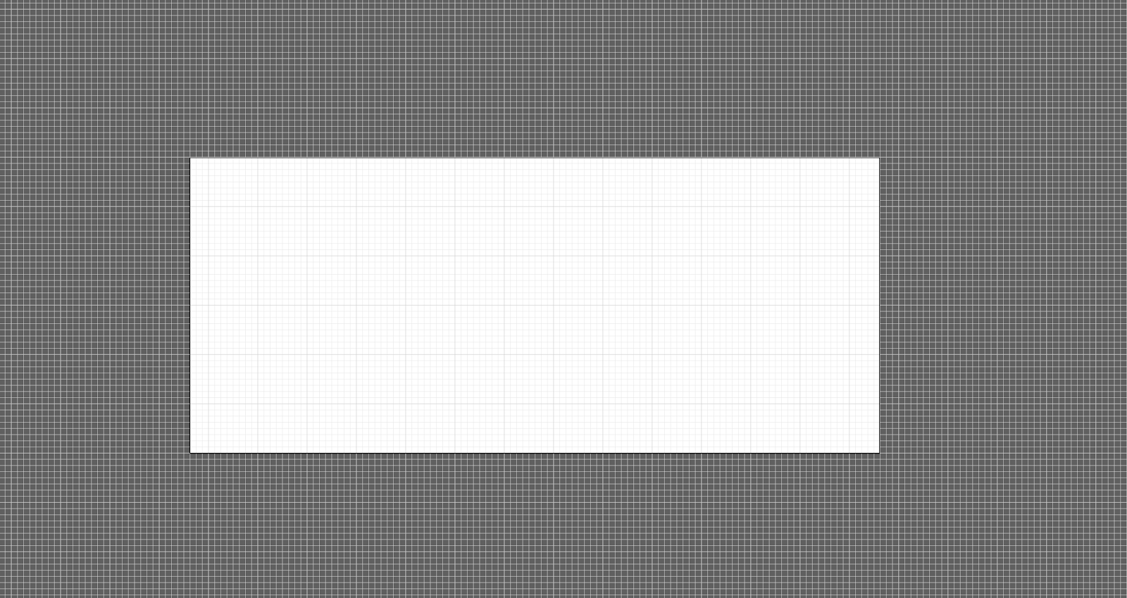
It is important to use the grid system as a guide, especially when creating multiple icons in one set. The grid ensures that all of your icons are as close to the same size as possible, creating a uniform and harmonious look and lending to the polished and put together look of your website or document.
Step 3: Designing Your Icons
Now it is time to put pen to paper, digitally speaking. Let’s begin making our book and shooting star icon.
The tool you will use the most in Adobe Illustrator is the Pen tool. It is the tool best suited to creating vector graphics because it allows for the maximum amount of control over the artistic flow of your icons. If you are unsure how to best utilize the Pen tool there are a lot of great tutorials and other resources available to help you gain mastery over the Pen tool.
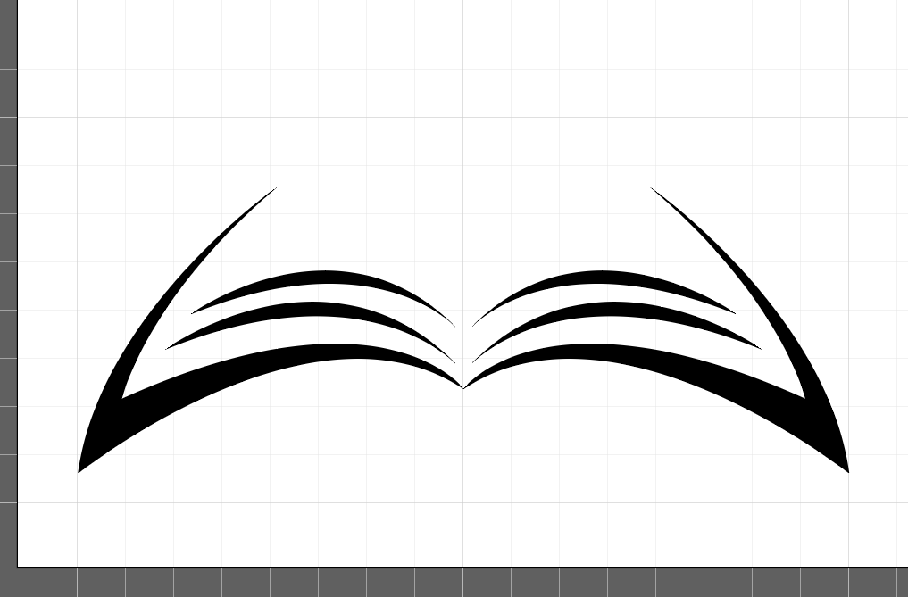
Well designed icons use crisp, clean lines, and are uncluttered. Let’s start by creating a set of lines that look like the edges of the book page, as illustrated in the example below:
Now that we have a starting point it is time to add more detail and really flesh out the image. Using your Pen tool create two identical shapes to sit on top of our first shape to add additional pages to our book. To see how this is done refer to the image below:

The open book portion of our icon is starting to take shape. The next step is to create the other half of the book by essentially copying and pasting it. To do this use the Select tool to select your entire design so far. Go to your drop-down menu and select Object, then Transform, then Reflect. Before you click Ok you may want to preview your work.
To do this go to the bottom left corner of the popup window and turn Preview on. Once you are happy with how your image looks click the Ok button to save your changes. Next, use your mouse to select the reflected image and move it into place, as shown in the image below:
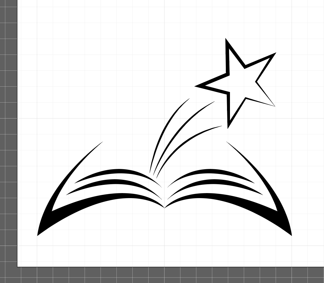
The image you have created is now starting to look like a book. Now it is time to start adding the shooting stars.
The most iconic image for shooting stars usually includes the star as well as a tail trailing behind it. In our icon this tail will fit between the book and the star, showing movement as the star shoots out from between the pages of the book.
When you are designing and placing your star keep the harmony of the entire icon in mind. In this icon the star will sit in the area above the book, while its tail will fill the void between the book and the star. Using your Pen tool create a star. While doing so make sure you select the endpoints of each line in the star to ensure they connect seamlessly to the other lines. For more detailed instructions on how to draw line segments with the Pen tool check out a tutorial here.
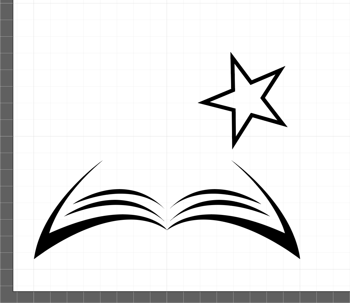
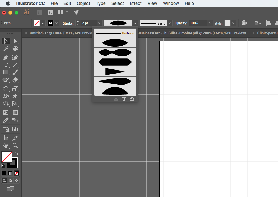
Now that you have your star let’s adjust it slightly to better fit with the feel of the book. As you can see the lines of the book start off thin at the edges and gradually thicken towards the centre. To make the lines in our star look the same you will have to adjust your stroke strength. To do this open the drop-down menu that allows you to adjust your line thickness and select Width Profile 1, as seen in the image below:
Now that we have applied the new width profile of our star’s lines the star fits better with the rest of the icon, as shown below:
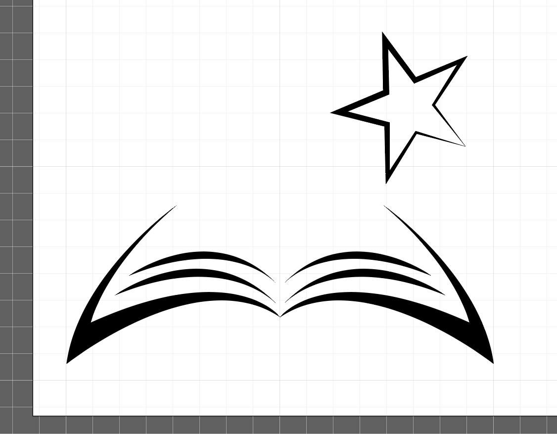
Next, we need to add our star’s tail. Using our trusty Pen tool we will employ a similar technique to the one we used to create our book pages. Draw several curved lines between the book and the star, and adjust the lines to the desired thickness profile using Width Profile 1.
The tail of the star is an important aspect of this icon. It denotes movement and creates a relationship between the book and the star shooting out of it.
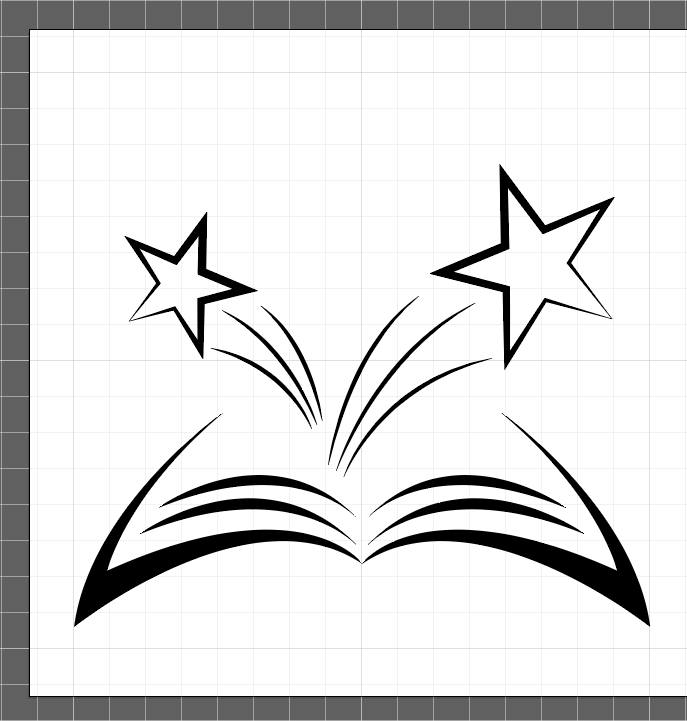
While our icon is looking good so far it feels a little lopsided. The right-hand side is visually heavier, pulled off centre by the star. By adding a second shooting star we can make the icon more visually balanced. To ensure our second star is consistent with the overall feeling of the icon it is easiest to use the Reflect tool and create a copy. Just like you did when you were creating the second half of your book use the drop-down menu to select Object, then Reflect, making sure to indicate that you want to reflect your object along the vertical axis. Make sure to preview your work before you commit.
However, instead of simply clicking Ok press Copy instead. Doing this will ensure that the object you have selected (in this case your shooting star) is copied as a mirror image. Next, all you need to do is shrink your new shooting star until it is visibly smaller than the first one. Once you have the size adjusted to your liking move it over to towards the left. When you are finished your icon should look similar to the one shown below:
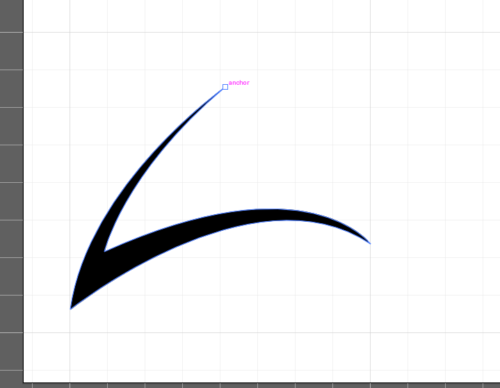
Our icon is almost finished. However, the tail of the second star needs some adjusting so that it is emerging from behind the tail of the first star. To do this we will use the Selection tool.
Using your selection tool Press A to activate your direct selection tool, then use your mouse to click on the bottom anchoring point of one of the lines in your second star’s tail, as shown below:
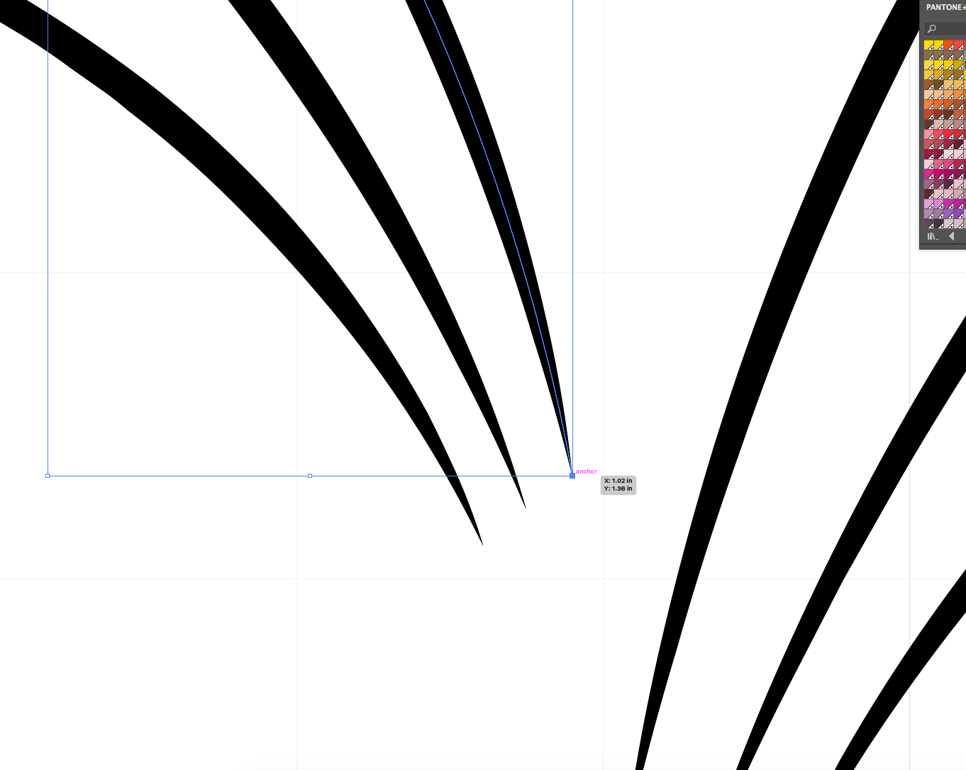
Move your anchor around until the ends of your lines are “cut off”, making it look like they are emerging from behind the tail of your first shooting star. Adjust your tail cut off points until you are satisfied with them. Your result should look something like this:
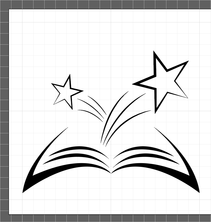
You have now finished creating your icon. Depending on your preferences you may want to give your icon a good looking over and see if there are any aspects of it you want to adjust. For example, you may want to make sure that all of your line ends are pointed and sharp, giving the overall icon a crisp, clean look.

As you can see our completed icon is black and white. Depending on your project you may want to keep your icon black and white, make it greyscale, or add other colours to it.
Now that you are familiar with the basic tools and techniques required to make an icon you can use that knowledge to create other icons. For example, we created icons representing nutrition, communication and development to add to our set.
Having the tools and knowledge to create your own custom icons is empowering. We covered just one of many methods for icon creation, so experiment and find a method that works best for you.
Adobe Illustrator is a powerful tool. The possibilities are limited only by your imagination, so set some time aside to experiment with all the different tools. The key to mastering any new skill is practice. Don’t be discouraged if your first few attempts at icon creation don’t end up looking quite like you envisioned. As you continue to hone your skills you will become faster, and gain the ability to create more detailed and elaborate icons.