

When was the last time you needed information quickly and used your mobile device? Probably 5 minutes ago, you might even be doing that right now! The percentage of people using their phones to surf the web has been steadily increasing for years. In 2019, 53 % of website traffic worldwide came from mobile devices.
With over half of patients using mobile to find and book an eye exam, it is time to prioritize website functionality on mobile devices. This is especially true since the data shows that 93% of people will quickly abandon their web search if the website does not display properly on their device.
What is a Responsive Website?
As the name suggests, responsive websites are designed to “respond” to the screen size being used. A responsive website will take the desktop version of a website and scale it to whatever size of screen being used. From smartphones to tablets, to even larger screens such as widescreen monitors, responsive websites will make sure that everything on your website will fit to scale.

Compared to a non-responsive website this is a huge upgrade! This offers flexibility and the opportunity to ensure a website will generally fit the screen size of each website visitor, regardless of device choice.
The Downside of Responsive
Responsive web design is not infallible. It essentially shrinks or expands the current website, which has typically been designed for a desktop. When you try to fit all content from a desktop website into a condensed mobile version, the result can lead to crowded information and images that don’t scale down well, creating a poor user experience.
People have different objectives when using their mobile devices compared to when they are sitting at their desktop. On mobile, they want to find important information quickly and easily, and often won’t be taking the time to read many of the details.
What is Mobile-Optimized?
When a website is designed with mobile optimization, it includes the scaling abilities from responsive, yet has features specific to screen sizes. With progressive enhancement, the content shown is truly optimized for mobile viewing, and as the screen size grows, it allows for more complexity (more content added) to deliver the best user experience for each device!
How These Websites Look on Mobile
Okay, let’s see these principles in action! Here is an example of a website that is responsive on a mobile device.
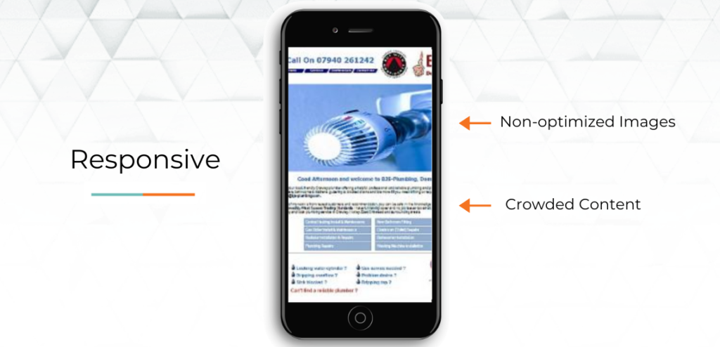
As you can see the content is a bit crowded and the images don’t seem to fit quite properly.
Now, here is a website designed with mobile optimization.
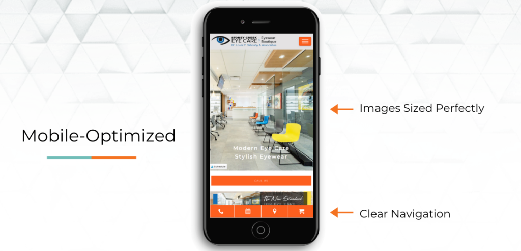
What you will notice here is that the page can be scanned more easily and the content is more digestible. The images were chosen specifically for a mobile experience and so they fit the screen perfectly. With this more simplified version, it is easier for users to find the information they are looking for quickly.
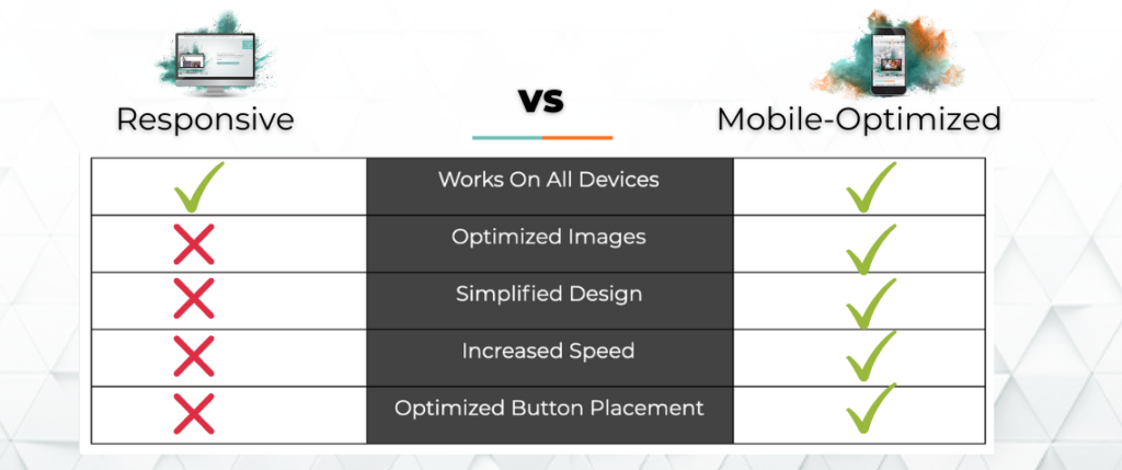
How Your Choice Affects User Experience
The biggest advantage of creating a mobile-optimized website lies within the user experience. As you can see in the chart below, by using progressive enhancement you significantly increase many of the key factors for improved user experience.
Why Practices Should Make the Switch
Improving the mobile version of your website will not just make it visually more appealing, but will actually get you more views. In 2016, Google created the mobile-first index which places a ranking priority on the mobile version of the website instead of the desktop version. What this means for business owners, is that if you want to increase your ranking on Google, the mobile version of your website needs to provide an excellent user experience.
Designing your website with progressive enhancement will ensure that no matter what device your patients are using, they will always get the best experience.
The last tip:
If you’re not sure how your website was designed, take a look at your website on your mobile phone. Are you happy with the way it looks? Is it easy to find the phone number or request an appointment? Try it on a tablet or someone else’s phone. This will give you an idea of how your website performs on multiple screens.
If you need help getting your website up to speed, book a demo with us. Designing websites for the eye care industry is our specialty!


